Skip navigation

Tag Archives: clouds

Carole Smith5

James Toole

Joyce Racine2

Linda Gerbers

Loren Bergren2

Pat Bassett5

Sharon Smith4

The above paintings were completed by the students in the Exploring Watercolor Beginning class that just ended.

This is the most difficult class I offer because of the magnitude of information and skills that are covered in a short period of time.

Many of these paintings are painted with student grade paints because I don’t want anyone to invest in the artist grade until they decide they are going to continue painting.

We learned basic strokes such as wet in wet, wet on dry and dry brushing. We learned how to soften an edge and the difference between a soft and hard edge. We studied value and how to create a dark by mixing several dark colors together. We learned the difference between opaque and transparent and made a chart of our own colors in order to determine the ones that were more opaque. We learned how to use salt, a sponge, masking fluid, splatter and how to make a rubber band brush for grasses and texture. We learned to grid and measure a format so the grid will work on the surface of our paper. We painted trees, skies or water, and little people. We spent one night discussing color and learning the color combinations that work well for artists.

If you would like to see all of their paintings click here. Thank you to all the students who shared their work here.

I was really sad to see this class end. The group worked so well together, learning from each other, asking questions, and eager to learn more. They always had assignments done, and often did two paintings.

Exploring Watercolor is the class we offer that gets the artist started with watercolor.

Here are examples of some of the things we do:

Todd Dunn5

Todd Dunn5

The first night is devoted to introducing the different brushes and their uses, the palette and how to set it up. They learn wet-in-wet, wet on dry and dry brushing applications and we talk about how to make convincing and rich  darks by using mixtures of dark colors rather than rushing to neutral tint or just paynes gray and ending up with a flat dark. The above painting shows darks created with mixtures of colors and has evidence of the three different ways to apply watercolor.

Lorri Medaugh5

Lorri Medaugh5

I also ask them to paint a backlit painting the first week. This gets them working with their darks from the beginning. It has been my experience that artists first bridge to cross is getting that contrast between light and dark. In watercolor, many artists fear getting dark too fast. One of my students chose a back-lit photo of hers that she had taken on vacation of a back-lit koi pond. I really liked the abstract quality of this. Note how her darks are washes of several colors mixing together on the paper.

Linda Flatley4  Analagous

Linda Flatley4 Analagous

Beth Akey 4   Complimentary

Beth Akey 4 Complimentary

Alan Pareis5   Primary

Alan Pareis5 Primary

The next week we learned about color and which ones were opaque and which were more transparent. We discussed color combinations and identified them on the color wheel. They all designed their paintings this week to a chosen color combination.

We also began practicing softening an edge and learned the difference between a hard and soft edge.

Alan Pareis2

Alan Pareis2

Lorri Medaugh4

Lorri Medaugh4

The next week was all about trees and how to paint them. We talked about using a liner or rigger to create the tiny branches. We learned how to use a sponge and frisket, about pointillism and scumbling,  dropping salt and splattering; all to create textural effects in our trees. Every painting these students brought in was fresh and new and they all brought their own take to the scene they created.

Susie Covitt5

Susie Covitt5

Todd Dunn4

Todd Dunn4

During the fourth week we painted studies of clouds, skies and water. What fun when they learned about tissue paper and lifting wet paint and swiping with a sponge or making wax resist clouds and frisketed foam on water. They were able to use their skill of softening an edge in these, also. We talked about how to paint reflections in water and how to save the white of  moon or sun and soften around the edges of the sun.

Susie Covitt2

Susie Covitt2

Linda Flatley2

Linda Flatley2

During the fifth week we practiced painting “little people” described before here and here. They learned simple dimensions of the human form, how to allow the colors to run together and how to ground them into the surface they were standing on by running a shadow off of them.

Beth Akey

Beth Akey

The last night of the class, we touched on buildings and how they are man-made shapes clustered together and that they cast shadows. They provide contrast with the surrounding natural forms.

Thank you to all of you who took this class and were willing to share your work, here, on this blog, for others to see. If you would like to see more of their work click here or scroll to the top of this page and click on Student Art: Exploring Watercolor.


clouds2

I have painted the above sky once before here. I don’t mind practicing from references I used previously. It’s nice to be able to see differences in a painting and to see if my skills have changed. I tried something new that I read about in a landscape book about skies and clouds. I used a sponge that I pre-wet and squeezed most of the water from to soften the top edges of the above clouds. I find it impossible to create interesting clouds without leaving hard edges everywhere. After my clouds had dried, I just took that sponge and lightly rubbed out the hard lines around the edges of the above clouds. I had to keep re-wetting and wringing the sponge to remove pigment that was lifted and to prevent smearing as I worked, but it really did the trick and fluffed up those upper edges. I also created that beam of light that bursts outward in the upper sky by dragging the sponge through the wet sky wash prior to it drying.  The water was created by sponging liquid frisket in the center area to save the bright white of the paper.  The lines of waves in the foreground were created by drawing them in with frisket, using a round brush.Once the frisket had dried, I washed on the colors for the water. This painting looks its best if viewed from a distance.

I don’t know if any of you have discovered that it is always best to get up and move to a distance of about ten feet and view your painting, in progress, from time to time. I find that a very useful practice for getting the value contrasts down. Most paintings are viewed from somewhere else in a room than right on top of them. I love going to an art museum and viewing a painting up close and then slowly backing up and see the whole thing come together. Several famous artists whose originals I’ve viewed, this way, and that really pack a punch when you back off them, are Van Gogh, Turner, Seurat and Monet. This never ceases to amaze me.

mexicocoast

A little over a year ago, I tried a new surface that I read about in the February 2012 issue of “Watercolor Artist” magazine. The artist was about Kathleen Conover. She uses a mixture she calls gesso juice for some of her paintings. The juice is made from 1/2  white acrylic gesso with 1/4 water and 1/4 acrylic matte medium.  You pour this on your watercolor paper and spread it over the surface with a credit card.  While it is still wet, slash marks in it and squiggle through it with the credit card to create texture and all sorts of calligraphic marks. Allow this phase to dry completely. I have found that you can adjust the ratio of the mixture. There is also a thick acrylic gesso and a more fluid one. Check the label. The more fluid one requires less water and matte medium. The thicker the gesso, the more slippery the surface.  This slippery surface is much like painting on yupo but not quite as slippery as some of the pigment does stain and adhere to the portions of  the surface where the gesso is not as thick. I like it much better than yupo and appreciate the lifting that can be done.

mexicocoast2

The above is my first washes of this painting. This is really a phase where I lay in the shapes and initial colors of my piece.

mexicocoast3

Next, I added richer color and began to shape and lift and shade the forms of clouds and waves. You can lift with a damp cloth, brush or Q-tip. Kathleen Conover has also used stencils she has made to apply color or wash color out by scrubbing. The design possibilities are endless as you can just keep re-modifying your painting until you are satisfied.

mexicocoast  finished painting

In the last step I shaped the waves and used acrylic white on the white caps.

I spray these with a matte fixative when I am finished.

bigsky


bigsky2


bigsky3


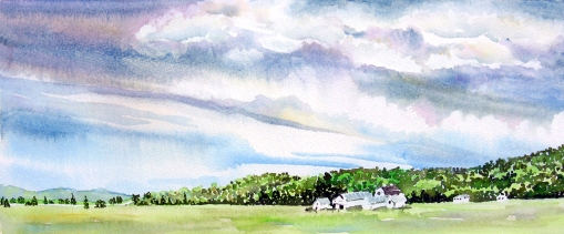
I’ve been practicing some cloud studies. These were painted on Arches 140lb rough watercolor paper.

My Granddaughter studied the first and second painting, above. She asked about all the dots for the trees. I told her that was pointillism and it was how I usually painted trees and foliage. I explained it was a way to add texture or a rougher look to certain things in a painting.  Of course she had to try it.  🙂   I love watching her work.  She selected a photo reference of a garden path. Below is her painting:


garden

I am following Heather on her blog. She is studying drawing and has been practicing value studies and making marks to describe form. This runs hand-in-hand with what my students started last week.  I decided to take a black and white photo of clouds (thank-you Wet Canvas!) and practice some mark making of my own. I introduced my class to the marks made by Degas, Van Gogh, Seurat and a few others that are found in the pages of Bert Dodson’s Keys to Drawing book. We spoke about how we needed to try and find the mark making that best suited us. I decided to try some mark-making of my own.

 2H, B and 6B pencils

In this study I drew my marks all one direction laying line next to line and going over areas that were to be darker with a softer lead pencil. I found this to be very tedious and time-consuming. Notice my angle strayed off to the right in the upper right hand corner. Bad me! 🙂

 2H, B and 6B pencils

In this study, I used the sides of my pencils. This was the quickest method to get these shapes and values down. In the past, this is what I see my students doing. Makes me wonder if other forms of mark making are too tedious and confusing for them in the beginning.  My other thought was that this form of shading comes in handy for a thumbnail sketch, done quickly, for a larger finished drawing or painting.

 2H, B and 6B pencils

This way was, by far, the most fun for me. I tried to imagine the form of the clouds I was seeing and attempted to emulate their contours and gesture by allowing the point of my pencil to scroll over and around them. I like the feeling of roiling clouds that I was able to capture with this mark making. Note I made my strokes over the sky flat. I saw no form in that and made my marks to reflect that.

 2H,B,6B pencils and gum eraser

In this attempt, I used crosshatching and incorporated curved lines laying next to each other as well as layers of lines going the other way to build up the layers of midtones and darks. This took longer than the contour/gesture study but was shorter than the lines laid next to each other study.  I like this study because it incorporates the contours as well as gives furthur definition to the cloud forms and allows me to achieve better values in the sky. I used a gum eraser to lightly touch up some areas around the rays and to soften some areas within the clouds.

A little light for your continued journey. Thank-you for your thoughts!


I follow a site titled Big Sur Kate. Late last summer she posted the above photograph.  I commented on all the beautiful color and that it was so surreal and different.  I have followed her photography because I saw, early on, that she incorporated a knack for great and interesting composition in her work. She was kind enough to offer this image for me to work from. Little did I realise how difficult it would be for me to reproduce in watercolor. The following are my attempts to paint this beautiful seascape.

          Cartiera Magnani 140lb coldpress

This is my first attempt. I didn’t like all the hard edges and did not feel I had enough definition in the clouds. I liked the brightness it captured but the darks were not deep enough and I couldn’t get the sea darker without disturbing the first layer of pigment.

Arches 140lb coldpress

This was my second attempt. I liked this much better but felt it lacked shape in the clouds.I liked the darks and the variation of color that was achieved, here.

Cartiera Magnani 140lb coldpress

This one approached the bright light I wanted in the upper portion of the sky and I liked the shapes in the sea but was still dissatified with the shapes I was achieving in the clouds.

Winsor Newton 140lb coldpress

I really liked the shapes that I achieved in this one but not the range of values. I wanted deeper darks and WHOOPS! Happy accident at the bottom; swampgrass? lol

  Arches 140lb coldpress

I was getting closer to the color I wanted.I liked the somewhat v shape of the underside of the clouds I got in this one and how it defined the streaks of reflected light on the water. It was here that I decided to change my approach and paint shapes in sections to define the clouds I wanted to achieve. I also decided I wanted to go with the essence of this v shape to create the next one.

Fabriano 140lb coldpress

This was my final attempt and I am pleased with it. The Fabriano coldpress allowed me to play in the pigment a little more. It would allow me to lift hard edges and re-design an area.  It also offered a surface that I could lay down abstract shapes with ease. I also pulled out the titanium white and enhanced portions of the clouds to gray out some areas and brighten the whites of the clouds on the top.

This entire venture made me appreciate the art of photography much more than I ever have. There are just some things that are captured with a camera that we would not have if  we had to paint it FAST! before it disappeared.  Thank-you, Kate, for sharing your art with me so I could learn valuable lessons here.

Oh. Some time ago, Isabelle challenged me to do a beach scene. Would this seascape qualify Isabelle? I didn’t forget. 🙂