Skip navigation

Monthly Archives: June 2009

ianlookingup  click enlarges

This was a quick and loose painting done from life on Lanaquerelle 140 lb coldpress paper. I really like how the water works a painting on this paper.

femalegorilla  chimp

               gorilla                                                                   chimp

The gorilla is done in ink and watercolor. The chimp is all watercolor.

bob         glen3

             Grandpa                                                                  Dad

It’s fun to paint your family’s portraits.

cattlecrossing

This is my second attempt with oil. The biggest challenge for me was getting the umbrella the way I wanted it to look and painting the wires. I do enjoy trying a new medium.

cardinals4

I was still not satisfied with the painting. When I can’t lay a finger on why I’m not totally satisfied, I splatter. I used three of my darks ( Sepia, phthalo turquoise, winsor red). I loaded a #10 round with watery dark pigment and tapped it against the index finger of my other hand aiming it where I wanted it to go. I directed the splatter from the bottom left and up the right side of the paper.

cardinals3

I was not happy with the light blue wash because it made it look as though these baby birds were sitting out in the open, so I repeated the background wash with winsor green. I then introduced large amounts of clear water around the birds and the nest just as the paper began to lose it’s shine but well before the wash was dry. This pushed the pigment back and made the cauliflower-looking shapes. I darkened the nest and detailed all the birds using the colors I have already listed but darker and in detail lines and shapes to give the figures definition. I made black around the adult birds’ beaks by layering phthalo turquoise, winsor red and sepia.

cardinals2

Next, I wet the background and worked my way around the piece washing in light washes of phthalo turquoise and quin. gold. I used winsor orange, sepia and some sap green, wet in wet, for the branches. I painted the orange to fill in the branch and fed sepia in on one side or a shadowed area. Where the branch was near some leaves, I introduced sap green with a small brush. I used mixtures of all the colors to create the nest and shadowed one side more than the other. The leaves were painted wet in wet with sap and winsor greens, burnt sienna, yellow ochre light and quin gold. I did not mask the center veins on the leaves but saved the whites and washed quin. gold in later.

cardinals

I selected an S shape for the composition for this painting of cardinals. I began with wet in wet washes on the birds. I allowed the colors to mix on the paper. I rarely mix watercolor on the palette. I used cadmium red, winsor red, winsor orange, quin. gold and sepia for these washes.

leavesandink

I painted these leaves last year in the park.They were those huge leaves that grow so tall. This particular grouping stood taller than me. I was intrigued with all the curvey line and how their colors flowed together. After painting them, I couldn’t decide what to do with the background, so I stowed it away for a couple months. Later, I read an article about filling in background with india ink and tried it. I used several different size brushes and very carefully washed the ink into the background being careful to overlap strokes while the ink was still wet. I let the whole thing dry overnight. There were some streaks but not many. The last thing I did was use Lamp Black Watercolor to go over the ink. The author had suggested this as a tool to soften the india ink. It did just that and balnced the two mediums a little better.

abstractlineportrait2   the drawing

mermaid   the painting

I have shown you one of these before. I do a simple continuous line drawing in a one to five minute study at life drawing and then trace it off onto watercolor paper with Saral and just have fun inventing something with paint and whatever skill I can muster up. It feels as though it’s half me and half the paint and I like that. It offers up a great way to explore a medium’s gifts and a fascinating way to get in touch with your own personal skills. I was so intrigued with the missing eye and arm. The eye, lips and hand were my focus.

gabe2

The last night of colored pencil class, the instructor gave us each a piece of  U-Art  800 paper. It is a very fine grained sheet of sanded paper. They also carry 400 U-Art paper for pastelists. This is the portrait I completed on my U-Art. I will definitely use this paper again. I loved how it felt to draw on. It did not eat my pencils up as quickly as other sand papers and clayboard have. I also like the fact that the background is a light tan color.That enables me to choose a wide range of colors to work with. There is a slight grain to the paper, so you start by working against the grain in your first layer and then at diagonals to the grain in subsequent layers. The finished product has a soft look to it. I have 4 layers on the background in this piece. It could have taken more.

leopard

Have you ever had a painting where the whole thing was just fun to do?  This was one of those for me. About the only thing I had to spend time thinking about was how to do the spots. Some of them are burnt sienna.  The rest are brown and black ink. Another thing that made this fun is that I chose a tall and narrow format. I like doing that once in awhile.

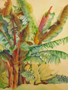
bananaplant

Here’s a fun technique we have done in class. We soaked our paper for about 5 minutes in a tub of water and then layed it out flat on a sheet of acrylic. If your paper bubbles up in areas when you lay it out,  peel up one edge and wet the back some more with a large flat and spread some more water on the top as you lay it flat again. You don’t want any raised areas when you begin. I used 140lb Arches cold press for this piece. You begin by laying in your background color and start painting your subject in bold strokes. As the paper begins to dry, you begin adding more and more detail. The drier the paper, the more detailed you become with your painting. It teaches you valuable lessons about how to let go and let the water and you begin to get the feel of when you can add detail. Just before the paper dries all the way, you must move your painting to your board or it may adhere to the acrylic. I have used this technique on about 6 paintings and have had no problems with it sticking to the acrylic. After the painting has dried completely, I may touch it up with a few more details. This is extremely useful for abstract watercolor.

Many thanks to Joshua Sellars who told me of a Haikuist who named himself “Basho”after the banana plant.He also shared a blog titled, Akita International Haiku Network where you can view a photograph of the above plant if you scroll to the bottom of this post.