Skip navigation

Monthly Archives: May 2013

tigerinthegrass

I have been working with different ink and watercolor techniques. I began the above painting with a line drawing of the tiger. The next thing I did was ink in about four of his stripes with a small watercolor brush and india ink (waterproof). Before each stripe dried, I spritzed it with water. The ink fans out in a fuzzy pattern to either side of the stripe. At first it looks like I am ruining my image, but as the ink dries, the color becomes lighter. I would dry that area with a hair dryer and move on to the next group of stripes and repeat the spritzing and the hair drying until I had the stripes done. I waited for this first step to dry and then repainted all the stripes so that the center of each one was as black as I could get it.  I worked black india ink into the shadows around the tiger, wet-in-wet, just like I use wet-in-wet with my watercolors.  After this stage dried, I painted with watercolor. If you click on the above image and click on it a second time, it will enlarge enough so you can move around it and actually see the textures the spritzed ink created on the surface of the watercolor paper.

I have done this type of ink and watercolor before.  You can view one I did with a nib here. I also have worked with an eye dropper here and here. This technique is defintiely not for the artist that wishes to control every element of  his/her painting. I find myself having to let go a little of my control and work with what we watercolorists call “Happy Accidents”. The reference image is just that, a reference image, because I usually have to stray from it in order to finish these.

Wow! One of my students gifted me with one of his old watercolor books and I have been pouring through all sorts of ideas on techniques he (Valfred Thelin) suggests.  I settled down to try one of them this week and had a great time!  Lots of chuckling. He spoke of drawing ink sketches with a razor blade and waterproof black ink and then painting them. You put ink in a saucer or ashtray with a low rim; he suggests an ashtray as good for this. I used an old saucer. Something deeper makes a mess as you reach in to dip the blade of the razor in the ink.  Then, all you do is dip the blade and begin drawing with it. I had to dip and draw a lot. Sometimes the blade would drop more ink, sometimes only a hairline.

razorblade2

The above drawing was my first attempt. He suggests that it is a quick way to get a subject down on paper and that the marks of the razor blade enhance any movement and adds to the interest of the subject. He uses ink to sketch people and sporting events a lot. I was not real happy with the above horse but did like the interesting marks it made. The darker marks were made by sliding the entire blade across the surface with several strokes. The thinner lines were drawn by tilting the blade and using one corner to draw with.

razorblade3

I  drew a herd of horses and decided this was the one I would use for a painting. Thank you to wet canvas for the photo references for this. I used two different ones and combined them into one composition.

razorblade4

I began by laying large washes behind the horses.

razorbladehorses finished painting

I finished by painting each horse and splattering the foreground.

I will use this technique again. I like the loose and sketchy line the razor blade leaves on the paper. I do think it enhances the movement of a piece.

The book I used is titled “Watercolor: Let the Medium Do It” by Valfred Thelin with Patricia Burlin.

blackhorse

I wanted to try something other than a landscape on the gesso juice surface. I love experimenting on this surface.

Thank you to wet canvas library for the image of the horse.


mexicocoast

A little over a year ago, I tried a new surface that I read about in the February 2012 issue of “Watercolor Artist” magazine. The artist was about Kathleen Conover. She uses a mixture she calls gesso juice for some of her paintings. The juice is made from 1/2  white acrylic gesso with 1/4 water and 1/4 acrylic matte medium.  You pour this on your watercolor paper and spread it over the surface with a credit card.  While it is still wet, slash marks in it and squiggle through it with the credit card to create texture and all sorts of calligraphic marks. Allow this phase to dry completely. I have found that you can adjust the ratio of the mixture. There is also a thick acrylic gesso and a more fluid one. Check the label. The more fluid one requires less water and matte medium. The thicker the gesso, the more slippery the surface.  This slippery surface is much like painting on yupo but not quite as slippery as some of the pigment does stain and adhere to the portions of  the surface where the gesso is not as thick. I like it much better than yupo and appreciate the lifting that can be done.

mexicocoast2

The above is my first washes of this painting. This is really a phase where I lay in the shapes and initial colors of my piece.

mexicocoast3

Next, I added richer color and began to shape and lift and shade the forms of clouds and waves. You can lift with a damp cloth, brush or Q-tip. Kathleen Conover has also used stencils she has made to apply color or wash color out by scrubbing. The design possibilities are endless as you can just keep re-modifying your painting until you are satisfied.

mexicocoast  finished painting

In the last step I shaped the waves and used acrylic white on the white caps.

I spray these with a matte fixative when I am finished.

bigsky


bigsky2


bigsky3


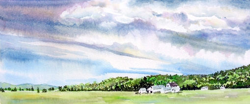
I’ve been practicing some cloud studies. These were painted on Arches 140lb rough watercolor paper.

My Granddaughter studied the first and second painting, above. She asked about all the dots for the trees. I told her that was pointillism and it was how I usually painted trees and foliage. I explained it was a way to add texture or a rougher look to certain things in a painting.  Of course she had to try it.  🙂   I love watching her work.  She selected a photo reference of a garden path. Below is her painting:


garden