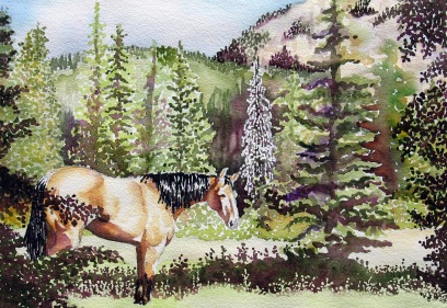
The above painting is the one I chose to paint for an assignment in my current landscape class. The assignment was to paint a landscape with trees paying careful attention to how you handled greens as well as what techniques you might use to re-create their textures. One could also insert a building or figure in their landscape, paying attention to its placement and form.
I used greens from my palette but mixed them with yellows, reds and magenta to calm down the garish look of brightness greens seem to produce when used alone. This has been a specific problem with greens for me. I used frisket for the dead pine tree right of center and pointillistic marks combined with wet-in-wet to render the other trees in this landscape. I was very careful to render the curvey forms of the buckskin horse, in the foreground, accurately. I tried to establish his form by painting his values correctly. His shoulders pierce the “sweet spot” for a center of interest in the lower left quadrant so I left him as he was in the photo reference. What I was most concerned with capturing was the brilliance of light throughout this scene, both in the horse and the landscape. I am very pleased with the combinations of colors that I chose to subdue my greens and will continue to experiment with this challenge, in the future. One of the students in my class never uses greens for his foliage and trees, choosing to use combinations of blues and yellows and neutralizing that with other colors and his look great!

26 Comments
Wow, beautiful stippling-type light effect. Wonderful textures! And of course I wouldn’t mind if most illustrations included a horse! He is a real beauty with the light across his coat. Love it!
Thank you, Cindy. …especially noticing the light. I think I was concentrating on that the most.
Nice depth, beautiful.
Thank you, so much! 🙂
This is wonderful. Love it. 🙂
Thanks, Cha! 🙂
Interesting to see the effect of magenta on green, had never thought of this before.. the textures and the horse itself makes this piece special, nice one Leslie!
I had never tried magenta with the greens, either. I think I like it because it is npot so “contrasty” (is that even a word, ha!) as some of the other reddish colors. Thank you, Padmaja.
Very fresh and alive, Leslie. I love what you do with the “shadow” colours. And the look on the horses’ face says so much; he must be enjoying being there.
In the photo reference, the horse had a halter with a lead rope dangling. It looked to fake, so I eliminated it and set him as though he was out to pasture. Thank you, Hannekekoop.
I love the depth in this piece and the beautiful setting for this horse. Just such a lovely painting, Leslie!
Thank you for noticing the depth, Sherry. The long shadow in the foreground was there, but had to play with values on the stands of trees and hillsides in the middle and back grounds. Good eye!
Gorgeous painting, Leslie! The light is amazing and I really love the horse! 🙂
Thank you, for that, Beth. I concentrated on the light the most. 🙂
O my day seems to be full of such wonderful nature images! Ahh, refreshing my winterized soul indeed, Leslie. Thank you for all the greenery.
Can you smell the pines, Eva? Thank you for this. I think I was thinking the same as you, while I painted this, searching for the light.
Your horse is beautiful…and I’ve always said I would recognize your foliage anywhere. You have a magic touch with trees. I very much like the light in this painting. And it has a bit of pointillism within the paint strokes.
You are so right about that pointillism, Carol. I don’t think I’ll ever be able to swish a tree. I always see them as bundles of texture. Maybe it’ll become one of my trademarks. I changed up that pine off the horse’s right and the one that sits a little back just to vary the look a bit in that area. Thank you!
Wonderful symphony of greens !Pointillism !! Oh what patience you have ! Beautiful light and good idea to ad the horse to bring a different color! Love it !
Thank you for that about the greens, Isabelle. I hope I keep getting colors of green more like this than the fantasyland bright ones I rendered before. It seems I need to concentrate more on what other colors to use in them than the greens, themselves.
Wonderful layering of landscaping and their textures! Have a wonderful, safe holiday Leslie!
Thank you, Ryan. Merry Christmas to you, too! 🙂
Superb!
Thank you, Kiaman! 🙂
Oh, lovely!
Thank you! 🙂